Full-time stats
Founder time is an estimate: writing three platform posts by hand against a three-minute voice note plus review in the dashboard. Draft states, screen and state rows and component boards are counted from the dashboard design plan and spec.
Match facts
- Role
- Founder & product designer
- Team
- Solo
- Timeline
- October 2026
- Platform
- Web app, desktop 1440 and mobile 390
- Discipline
- SaaS Product Design
- Industry
- B2B SaaS · Founder Personal Branding
- Tools
- pen.dev
Before → after
- Founder time per week
- 120 min to 10 min
- Draft states designed, each with one main action
- 0 to 12
- Screens and states designed
- 0 to 77
- Component boards
- 0 to 8
How the match went
From the brief at kick-off to the result at full time.
- Minute 0, Kick-off
The brief
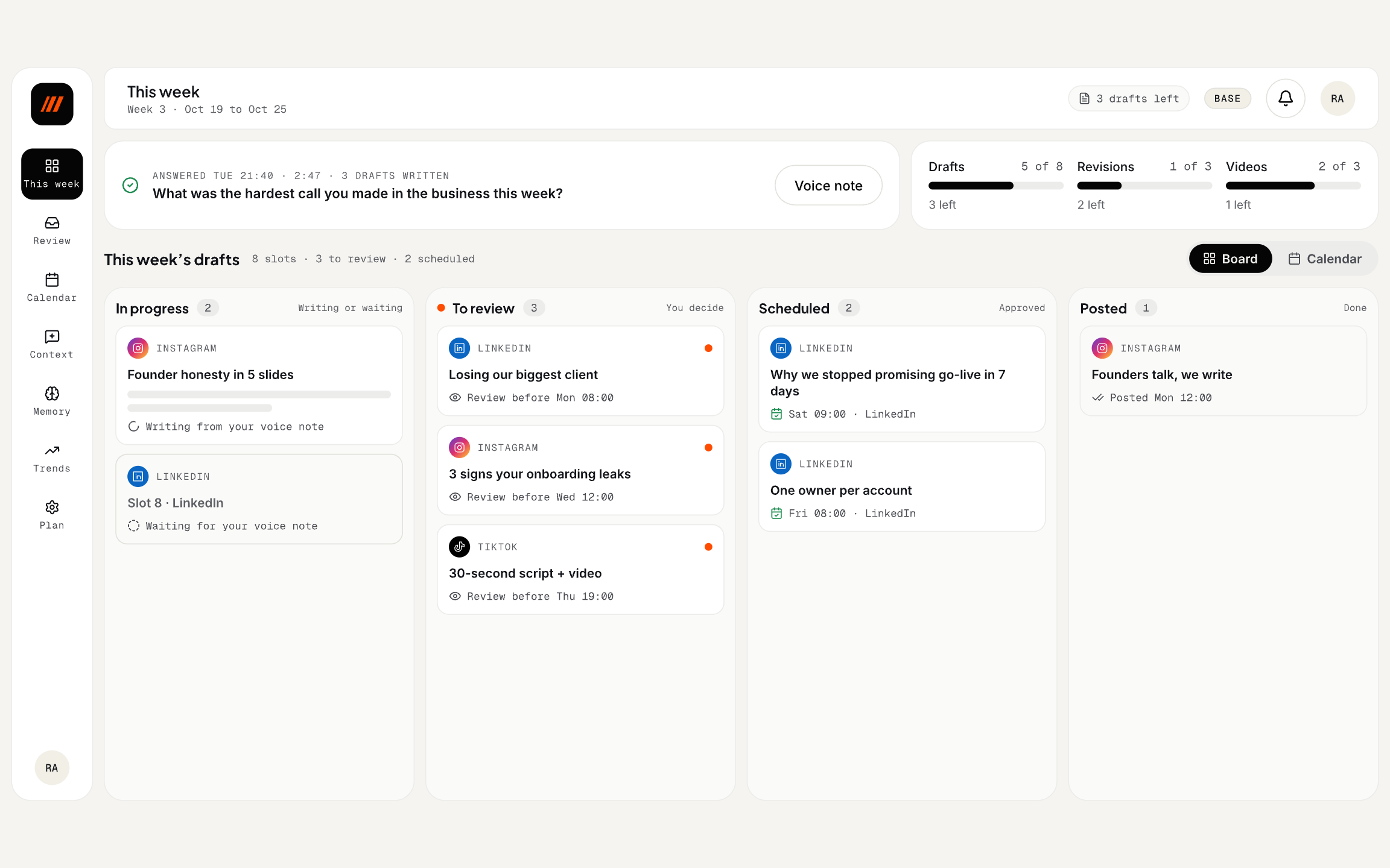
The dashboard of Ngejawantah, my voice-to-content product for founders: where a founder sees the week, reviews the drafts written from their voice note, approves them and tunes their voice.
Designed in pen.dev: four modules, 77 screens and states across desktop and mobile, and eight component boards, ready to be built.
- Minute 15, The opposition
The problem
Founders send a voice note in chat and get drafts for LinkedIn, Instagram and TikTok. Chat is good for telling a story, not for seeing a week of posts, checking where a line came from or changing a scheduled post.
- Trustan assistant writing in the founder’s name must never post or change words behind their back.
- Statea draft can be writing, ready, scheduled, locked, on hold, corrected, published or failed, and each needs a clear next step.
- Timethe founder gives a few minutes a week; the dashboard must not become another job.
The question
How might we give founders full control over posts in their name, in a few minutes a week?
- Minute 35, Game plan
Goals and key features
BeforeBefore, the product lived only in chat: the weekly question, the voice note and an "ok" reply, with no place to see the week or trace a draft back to its source.
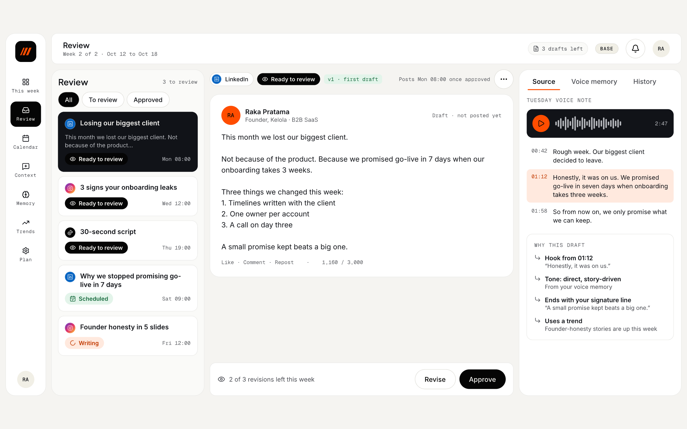
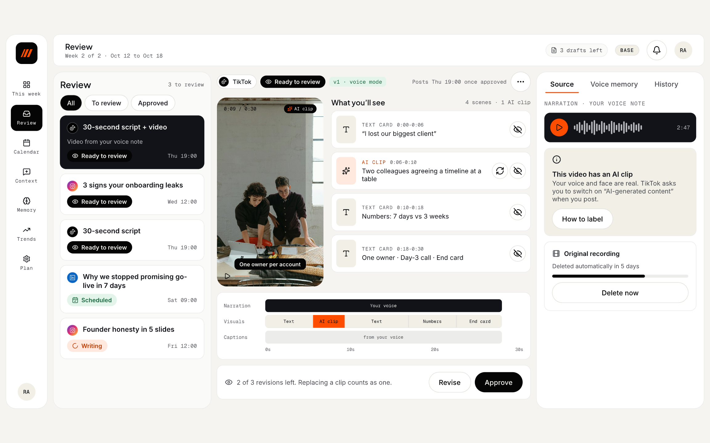
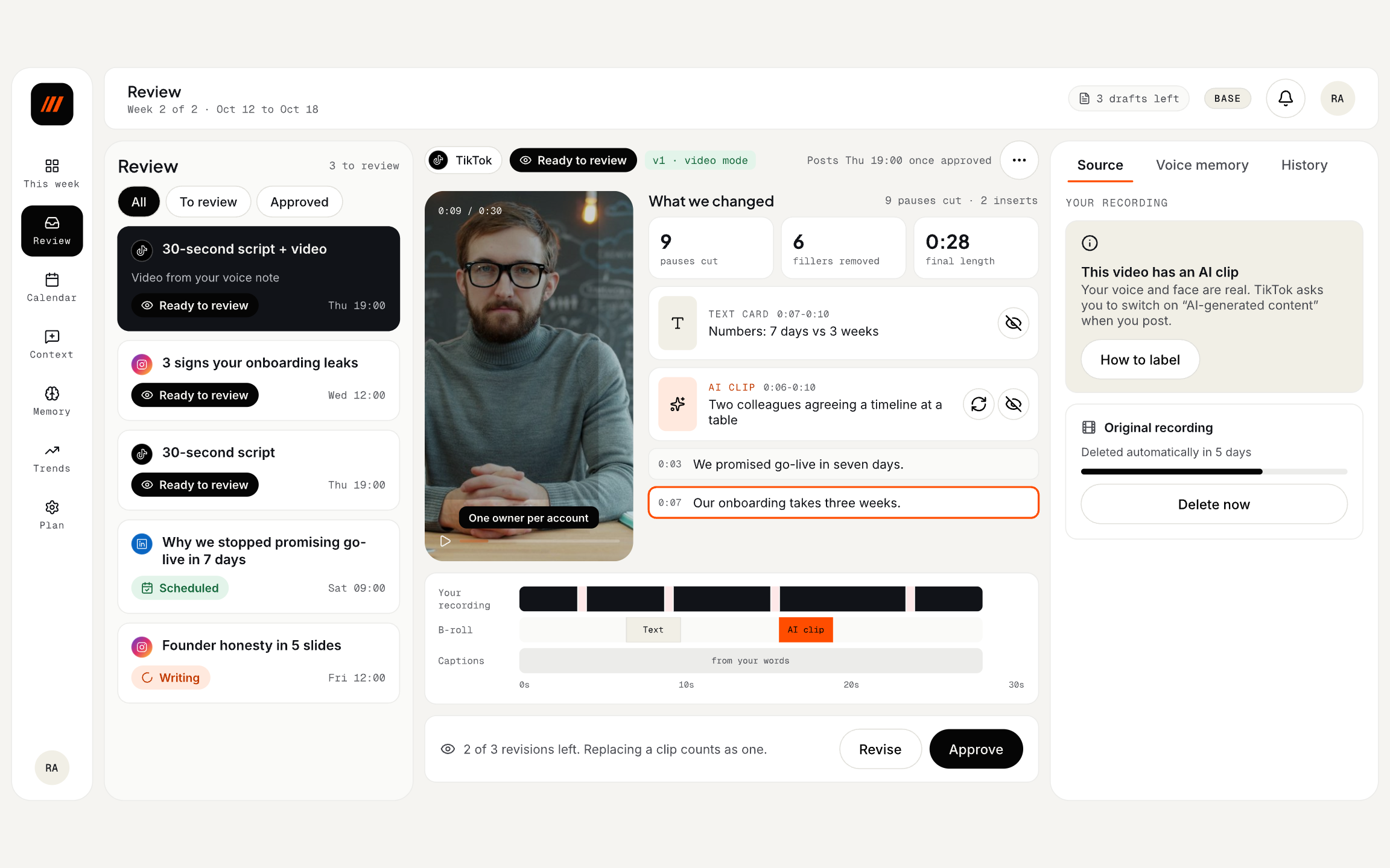
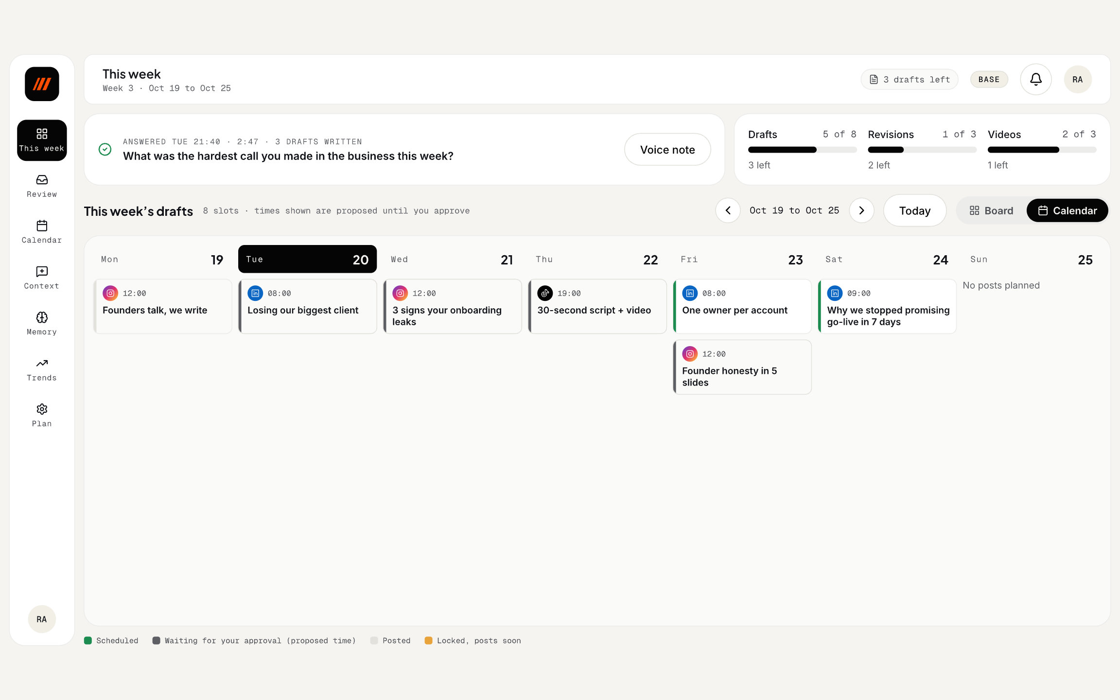
AfterAfter, a dashboard designed around one decision per screen: the week at a glance, a review queue with one editor per platform, the source beside every draft, and video review.
- 01Onboarding about the business, audience and speaking style
- 02This week: the whole week at a glance
- 03Review queue with one editor per platform
- 04Source panel: transcript, why this draft and voice memory
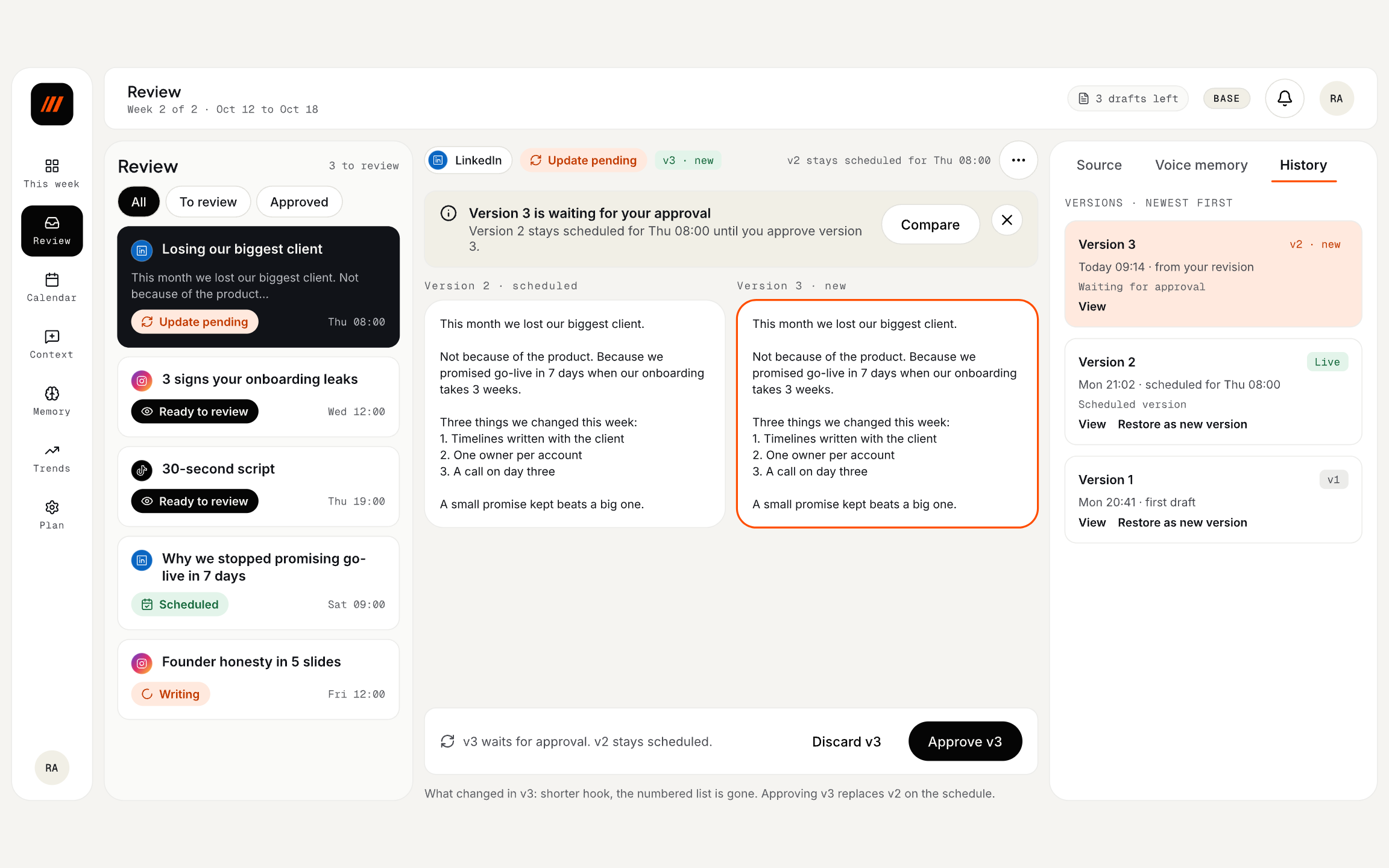
- 05Approve, revise, hold or cancel, with version history
- 06Video review
- 07Desktop 1440 and mobile 390 layouts
- Minute 60, The play
How it was solved
- Principles firstsix rules came before any screen. Nothing goes live without approval, text being read never changes by itself, the source is always visible, limits are shown kindly, one screen means one main decision, and Telegram and the dashboard share one source of truth.
- Three panelson desktop the review queue, the editor and the source panel (transcript, why this draft, voice memory) sit side by side, with mobile layouts designed at 390 px.
- Every state designedtwelve draft statuses, each with exactly one main action, mapped across 77 screen and state rows before anything is built.
- Components as a systemeight component boards and tokens (a warm stone background, one orange accent, Plus Jakarta Sans, Inter and Geist Mono), targeting WCAG 2.2 AA.
- Minute 90, Full time
The result
The design covers onboarding, This week, review and approval, and video across desktop and mobile: 77 screens and states, twelve draft statuses and eight component boards, ready to be built. The landing page already previews it in its animated demo.
Key decisions
The choices that shaped the project, the reasoning behind them, and what they cost.
Chat first, dashboard second
- The problem
- Busy founders will not adopt one more app just to tell a story.
- The call
- The weekly question, the voice note and the "ok" all happen in chat; the dashboard is for seeing the week and tuning the voice, and is never required.
- Why
- The habit of sending voice notes already exists; the product rides on it instead of asking for a new one.
- Trade-off
- Two surfaces have to stay in sync: every action in chat shows in the dashboard and the other way round.
Nothing goes live without approval
- The problem
- An assistant that posts on its own puts the founder’s name at risk and erodes trust.
- The call
- Every draft waits for an explicit approve; a new version never looks approved, and the text being read never changes by itself.
- Why
- It is the founder’s voice and reputation, so the founder keeps the last word on every post.
- Trade-off
- One more tap every week, accepted as the price of trust.
Show where every line came from
- The problem
- AI drafts feel generic, and founders cannot tell what came from them.
- The call
- Each draft points to the moment in the voice note it used ("Hook from 01:12") and to the voice memory behind its tone.
- Why
- Seeing their own words in the source turns doubt into trust, and makes edits teach the memory.
- Trade-off
- A third panel in the review screen, so the editor stays the clear focus.
Design every state, not just the happy path
- The problem
- A scheduled post can be revised, locked an hour before posting, put on hold, corrected or cancelled.
- The call
- Twelve draft states, each with exactly one main action and the others one level down.
- Why
- One screen, one decision: the founder always knows what the next step is.
- Trade-off
- More design work up front, in exchange for fewer surprises once it is built.
Updates arrive as a marker, not a rewrite
- The problem
- A new version can land while the founder is reading or about to approve.
- The call
- The text on screen never changes by itself; a newer version shows as a banner to compare and approve.
- Why
- Reading and approving should never race the machine.
- Trade-off
- One more click to see the newest version.
Replays
Screens from the final design. Keep scrolling to roll the replay.